Posts

Showing posts with the label death cross

Technical indicators comparison - Stochastic versus MACD
Image
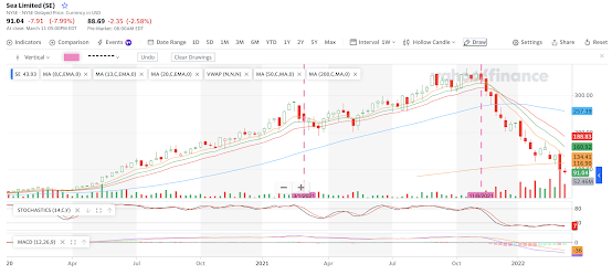
My investment approach is mostly long term assets where I hope that I can hold on to them for years or decades.  Today, I will compare 2 common indicators - stochastic and MACD. Steps to investing I will usually start with a financial analysis of the company (over several years) to qualify a company . After which, I will look for an entry point (with a margin of safety) where I will deploy my technical setup for entry.  For trends, I would be looking at either 1 Day chart or 1 Week chart for a start.   For $SE, I could not "invest" in the company as its financial fundamentals are not convincing.  I maintain that the performance of the business must make it a "no brainer" for me to invest.  Given that the gaming market has 3 billion users, this company remains an area of interest.  On top of gaming, $SE has also ventured into e-commerce and fintech which could increase their total addressable market (TAM) significantly.     1W cha...

Relationship of Golden and Death Cross

Image
  Recent Death (and Golden Cross) for S&P500 (1 Day chart) S&P500 1D chart as per 20Mar2022 Death cross  happens when 50 days moving average cuts the 200 days moving average from above, a typically bearish signal. Whereas, a  golden cross  happens when 50 days moving average cuts the 200 days moving average from below, a typically bullish signal. Here are some dates when death and golden crosses happened on S&P500 recently: Death Cross on 6 Dec 2018 Golden Cross on 29 Mar 2019 Death Cross on 27 Mar 2020 (market started to fall from 24 Feb 2020 due to the Covid outbreak) Golden Cross on 9 July 2020 Death Cross on 15 Mar 2022 While it is vain to time the market, the duration between recent death and golden crosses were 3 to 4 months (based on the recent occurrences) . I have an observation about both the golden and death cross for S&P500 which are usually lagging indicators . The  rise or decline could happen before or after the cro...

Week in review & what to expect in the coming week - 19Mar22

Image
The week ended with a good rally in the US after the decline since the start of 2022.  Is this the bullish reversal that the market is looking for? S&P500 as per 19Mar2022 The technicals point to an uptrend as per the 1 Day chart above .  I remain optimistically cautious as we saw a death cross formed recently on 15 Mar 2022.  It would be good if this is the reversal of the market downtrend.  1 Day stochastic is pointing to a "pullback" soon as it approaches the overbought region.  Of course, the market can continue to move with stochastic ranging along the top "overbought region" for endured periods.   Performance by sectors as per market close 18Mar22 As per above, almost all sectors saw recovery except for utilities as investors turned away from "defensive" stocks in lieu of the "rally". Coming pullback and potential black swans The coming "pullback" would be an important indicator if the recent lows would be challenged.  There a...

S&P500 approaches key support region of 4100 (08Mar2022)

Image
S&P500 - a death cross looks to be forming. Let us monitor with 4000-4100 a key support range.  S&P500 continues its downtrend While energy companies Chevron $CVX and gold continue to surge, the rise in fuel costs will send inflationary pressures to the rest of the sectors.  Let us monitor the situation.  This is a war driven inflationary pressure that can ease when the Ukraine conflict has concluded.   If we believe in the fundamentals of the businesses, we should not be overly concerned after we have done our due diligence.  (A death cross happens when the 50 days moving average line cuts the 200 days moving average line from above - a typically bearish signal based on a 1 Day chart.)